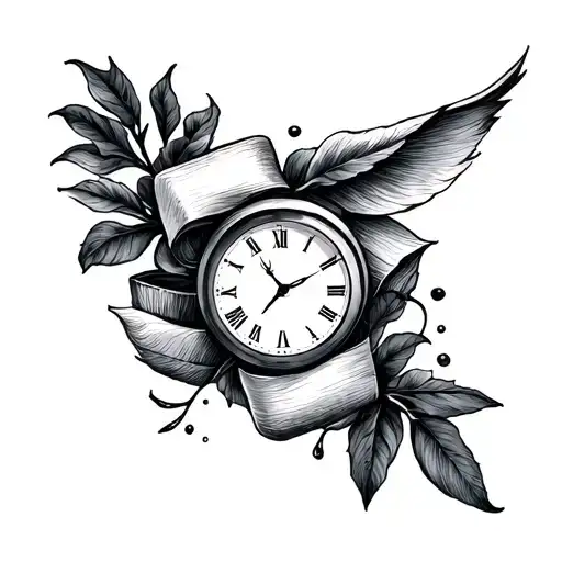
1/2 • Click to zoom
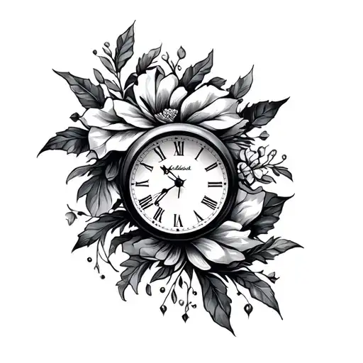
Presence outweighs material possessions in this meaningful typographic design. The phrase anchors the composition using crisp black-grey ink, often paired with subtle clockwork imagery or floral accents to soften the geometry. Fine line techniques ensure the text remains legible without heavy bolding, creating a delicate aesthetic suitable for daily wear. This piece symbolizes prioritizing moments over objects, serving as a permanent reminder to invest time in loved ones. Ideal for clients seeking subtlety with deep personal resonance. The layout works well on linear body contours where text can flow naturally with muscle structure. Black-grey shading adds depth without the commitment of vibrant color, allowing for easier touch-ups over decades. Whether standalone or integrated into a larger sleeve, this design maintains clarity across various sizes. Artists typically recommend custom typography to avoid generic font appearances, ensuring the lettering matches your personal style. Proper spacing between characters prevents blurring as the skin settles. This design appeals to those valuing minimalism and sentimentality over ornate decoration. Consider lighting conditions when choosing placement to ensure readability in different environments.
Noticeable discomfort, prepare for some sensitivity
Expect moderate discomfort on bony areas like the collarbone due to thin skin. Inner forearm remains tolerable for most clients, feeling like a persistent scratch. Fine line work requires stillness, increasing perceived fatigue during sessions. Use rhythmic breathing to manage tension while the artist focuses on precise lettering. Hydration and rest prior to appointment significantly reduce sensitivity levels.
Text-based designs require flat surfaces to maintain readability over time. The inner forearm provides ample space for horizontal layout with moderate pain levels, making it ideal for first-timers. Collarbone placement offers high visibility but sits directly on bone, increasing discomfort during sessions. Ensure the text height remains above half an inch to prevent ink spreading from obscuring letters. Avoid high-friction zones like fingers or palms where rapid fading occurs. Consult your artist regarding font size relative to body curvature to guarantee long-term legibility.
lettering is a distinctive tattoo style characterized by Fine Line: Fine Line tattoos use single-needle or small needle groupings to create delicate, detailed designs with thin, precise lines. Popular for small tattoos and intricate imagery, this style achieves remarkable detail while maintaining an elegant, understated aesthetic. Lettering: Lettering tattoos focus on typography as the primary design element, featuring custom fonts, hand-lettered text, and creative text compositions. From elegant calligraphy to bold block letters, these designs turn words into visual art.. This style has gained popularity for its versatility and visual appeal.
Yes, this design is well-suited for square placement. This lettering design is ideal for square placement. Consider consulting with a professional tattoo artist about the best placement for this design.
The duration depends on the size, complexity, and detail level. A design of this style typically requires 2-4 hours for a medium-sized piece, but consult with your artist for an accurate estimate.
Tattoo pricing varies by artist, location, and design complexity. Prices typically range from $150-$500+ for a design of this style. Always consult with your chosen artist for an accurate quote.
Proper aftercare is crucial for square tattoos. Keep the area clean, moisturized, and protected from sun exposure. Follow your artist's specific aftercare instructions for best results.
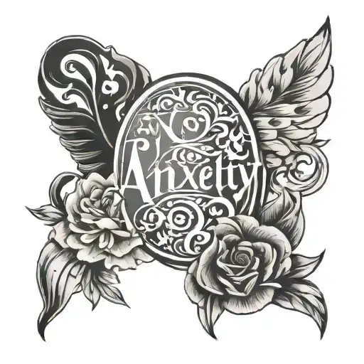
square
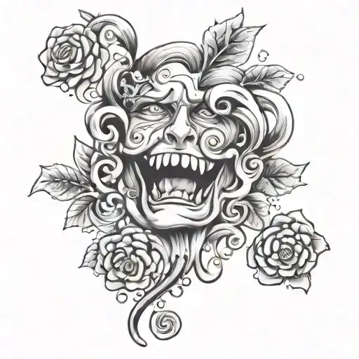
square