1/4 • Click to zoom
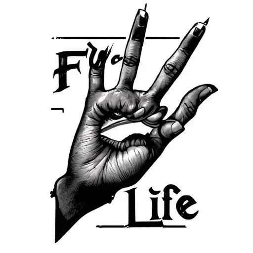
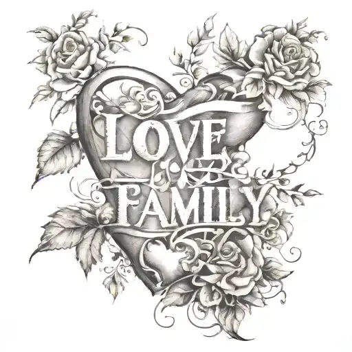
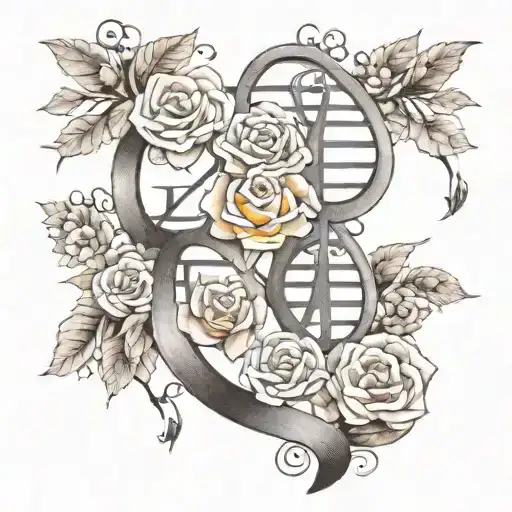
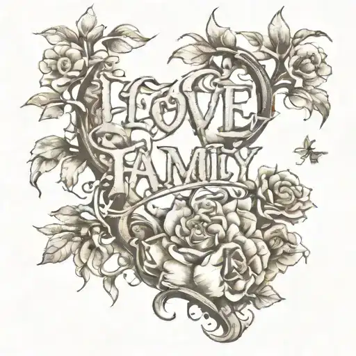
Celebrating the bonds that matter most, this design transforms meaningful words into permanent art. The composition focuses on crisp typography rendered in black-grey ink, prioritizing legibility and flow. Whether executed in flowing script or bold lettering, the text anchors itself as a daily reminder of connection and priority. This style works exceptionally well on linear body areas where the text can follow natural muscle structure without distortion. Ideal canvases include the inner forearm or collarbone, allowing the words to remain visible during casual wear while staying easy to conceal for formal settings. The minimalist approach ensures the message remains the focal point, avoiding unnecessary ornamentation that might distract from the sentiment. Artists recommend sizing the text large enough to prevent blowout over time, ensuring each letter retains its shape as the skin ages. This piece serves as a personal manifesto, worn close to the pulse points where the sentiment feels most alive. Searchers looking for meaningful text work often prioritize clean lines and timeless fonts over trendy effects.
Noticeable discomfort, prepare for some sensitivity
Expect moderate discomfort on the inner forearm due to thinner skin near the wrist. The sensation resembles a persistent scratch rather than sharp pain. Nerve density increases closer to the inner wrist, raising sensitivity. Maintain steady breathing to manage tension, as tightening muscles amplifies discomfort. Hydrate well before the appointment to improve skin elasticity.
For text-based designs, the inner forearm offers the flattest surface area, ensuring letters remain legible over time. Position the design parallel to the arm's length to prevent distortion during movement. The collarbone provides a sophisticated horizontal canvas, though skin thinness requires a skilled hand. Wrist placement works for shorter phrases but consider visibility in professional environments. Maintain a minimum width of three inches to prevent ink spread from blurring fine details. Avoid high-friction zones like the hands or feet where text fades rapidly. Symmetrical placement on both arms creates balance if matching sets are desired.
lettering is a distinctive tattoo style characterized by Fine Line: Fine Line tattoos use single-needle or small needle groupings to create delicate, detailed designs with thin, precise lines. Popular for small tattoos and intricate imagery, this style achieves remarkable detail while maintaining an elegant, understated aesthetic. Lettering: Lettering tattoos focus on typography as the primary design element, featuring custom fonts, hand-lettered text, and creative text compositions. From elegant calligraphy to bold block letters, these designs turn words into visual art. Minimalist: Clean, simple tattoos featuring essential elements with minimal detail. These understated designs focus on clean lines, negative space, and refined simplicity, proving that sometimes less truly is more.. This style has gained popularity for its versatility and visual appeal.
Yes, this design is well-suited for square placement. This lettering design is ideal for square placement. Consider consulting with a professional tattoo artist about the best placement for this design.
The duration depends on the size, complexity, and detail level. A design of this style typically requires 2-4 hours for a medium-sized piece, but consult with your artist for an accurate estimate.
Tattoo pricing varies by artist, location, and design complexity. Prices typically range from $150-$500+ for a design of this style. Always consult with your chosen artist for an accurate quote.
Proper aftercare is crucial for square tattoos. Keep the area clean, moisturized, and protected from sun exposure. Follow your artist's specific aftercare instructions for best results.