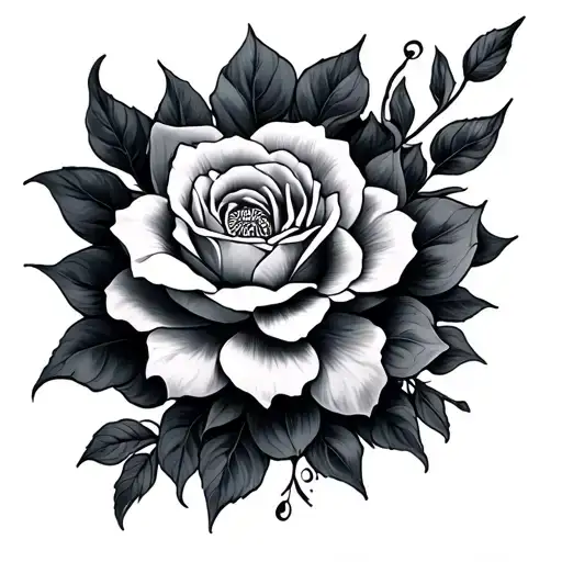
1/2 • Click to zoom
This design features the name Alinnis rendered in sophisticated black-grey typography, capturing a sense of mystery and elegance. The lettering flows with organic curves, utilizing fine line work to create depth without heavy saturation. Ideal for individuals seeking a personal tribute or fantasy-inspired text piece, the shading gradients give the letters a three-dimensional quality. The composition balances negative space with bold strokes, ensuring legibility across various sizes. Placement options range from visible areas like the forearm to more intimate spots such as the ribs or collarbone. This piece works well for those wanting a subtle yet meaningful statement. The black-grey palette ensures longevity and clean healing over time. Artists should focus on consistent needle depth to maintain the smooth gradient transitions throughout the script. Whether chosen for its personal significance or aesthetic appeal, the design adapts well to body contours. The lack of color allows the focus to remain strictly on form and structure. Clients should consider sizing that prevents blurring over decades. Proper aftercare maintains the crisp edges of each character.
Noticeable discomfort, prepare for some sensitivity
Expect moderate discomfort on the forearm, rated around 45 out of 100. The inner forearm contains more nerve endings than the outer section, increasing sensitivity during shading. Fine line work requires slow, precise passes which can feel like a hot scratch. Breathing techniques help manage discomfort during longer sessions. Topical numbing creams are effective for text-heavy designs if approved by your artist. Stay hydrated to improve skin resilience during the session.
For optimal flow, place this design on the inner-forearm or outer-wrist where the skin surface remains relatively flat. The rectangular nature of the text suits the forearm's longitudinal axis, following the muscle structure naturally. Collarbone placement offers a sophisticated look but requires careful sizing to avoid distortion during movement. Avoid highly mobile areas like the elbow ditch to prevent letter warping. Minimum width should be 3 inches to preserve detail in the lettering serifs. Visibility is moderate on the forearm, easily covered with long sleeves for professional settings. Ensure the artist maps the baseline correctly to prevent uneven hanging.
lettering is a distinctive tattoo style characterized by Fine Line: Fine Line tattoos use single-needle or small needle groupings to create delicate, detailed designs with thin, precise lines. Popular for small tattoos and intricate imagery, this style achieves remarkable detail while maintaining an elegant, understated aesthetic. Lettering: Lettering tattoos focus on typography as the primary design element, featuring custom fonts, hand-lettered text, and creative text compositions. From elegant calligraphy to bold block letters, these designs turn words into visual art.. This style has gained popularity for its versatility and visual appeal.
Yes, this design is well-suited for square placement. This lettering design is ideal for square placement. Consider consulting with a professional tattoo artist about the best placement for this design.
The duration depends on the size, complexity, and detail level. A design of this style typically requires 2-4 hours for a medium-sized piece, but consult with your artist for an accurate estimate.
Tattoo pricing varies by artist, location, and design complexity. Prices typically range from $150-$500+ for a design of this style. Always consult with your chosen artist for an accurate quote.
Proper aftercare is crucial for square tattoos. Keep the area clean, moisturized, and protected from sun exposure. Follow your artist's specific aftercare instructions for best results.
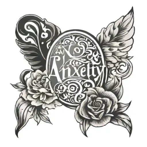
square
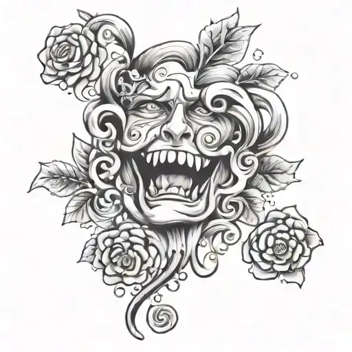
square