1/2 • Click to zoom
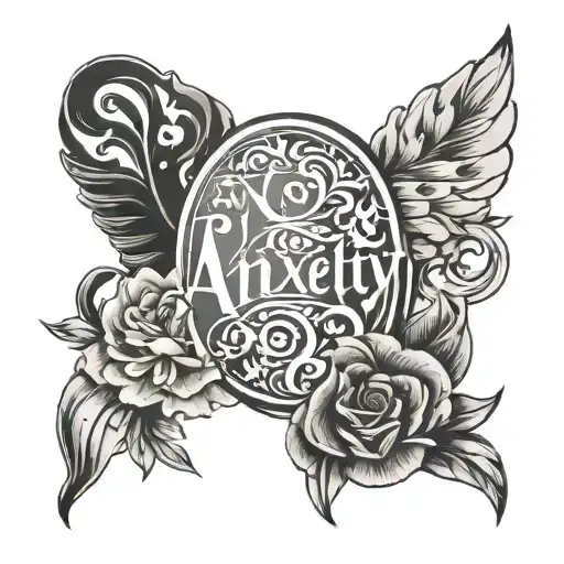
Representing the complex spectrum of human emotion, this design translates internal struggles into visible art. Executed in black and grey ink, the typography balances weight and spacing to reflect the shifting states of anxiety, happiness, and depression. Ideal for those seeking a personal reminder of resilience, the composition avoids heavy shading, relying instead on crisp linework for longevity. This piece works well on flat surfaces where text remains legible over time. Whether displayed openly or kept private, the design offers a subtle yet powerful statement on mental health awareness and personal journey without relying on clichéd symbolism. Placement options prioritize skin stability to prevent letter distortion. The minimalist approach ensures the message remains the focal point, resisting trends that may date the artwork. Clients often choose this style for its clarity and direct communication of lived experience. Professional application ensures clean edges, maintaining readability as the skin ages naturally over decades.
Manageable pain, suitable for most people
Expect moderate discomfort primarily from needle vibration on superficial nerve endings. Fleshy areas like the outer bicep tolerate extended sessions better than bony regions. Text work requires steady hand positioning, which may increase sensation duration. Utilize controlled breathing techniques to manage tension during intricate lettering segments. Hydration prior to appointment reduces skin sensitivity significantly.
For text-based designs, flat surface areas ensure maximum readability. The outer forearm offers high visibility and stable skin, minimizing distortion during muscle movement. Outer bicep placements provide a more private option while maintaining sufficient canvas space for legible lettering. Calves present a vertical option suitable for stacked text arrangements. Avoid high-friction zones like hands or feet where text blurs quickly. Minimum width should exceed two inches to prevent ink spreading from compromising character definition. Consider professional visibility before choosing exposed areas like the forearm.
lettering is a distinctive tattoo style characterized by Fine Line: Fine Line tattoos use single-needle or small needle groupings to create delicate, detailed designs with thin, precise lines. Popular for small tattoos and intricate imagery, this style achieves remarkable detail while maintaining an elegant, understated aesthetic. Lettering: Lettering tattoos focus on typography as the primary design element, featuring custom fonts, hand-lettered text, and creative text compositions. From elegant calligraphy to bold block letters, these designs turn words into visual art. Minimalist: Clean, simple tattoos featuring essential elements with minimal detail. These understated designs focus on clean lines, negative space, and refined simplicity, proving that sometimes less truly is more.. This style has gained popularity for its versatility and visual appeal.
Yes, this design is well-suited for square placement. This lettering design is ideal for square placement. Consider consulting with a professional tattoo artist about the best placement for this design.
The duration depends on the size, complexity, and detail level. A design of this style typically requires 2-4 hours for a medium-sized piece, but consult with your artist for an accurate estimate.
Tattoo pricing varies by artist, location, and design complexity. Prices typically range from $150-$500+ for a design of this style. Always consult with your chosen artist for an accurate quote.
Proper aftercare is crucial for square tattoos. Keep the area clean, moisturized, and protected from sun exposure. Follow your artist's specific aftercare instructions for best results.
square