1/4 • Click to zoom
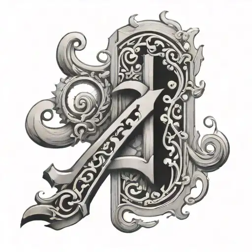
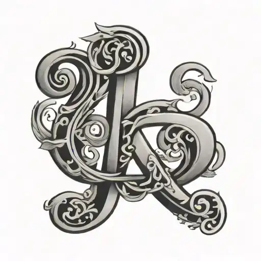
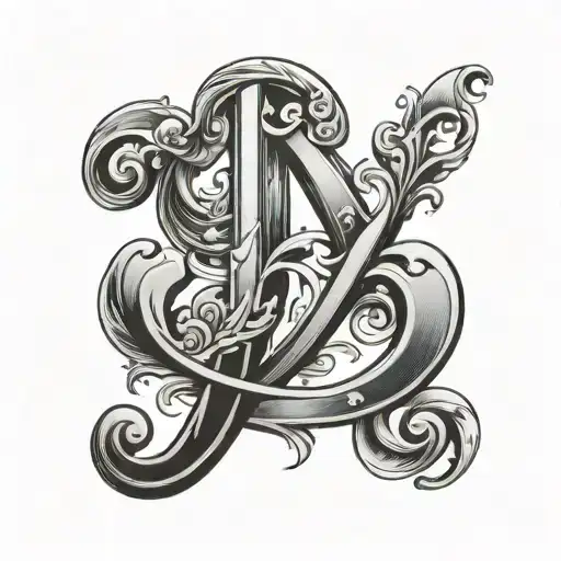
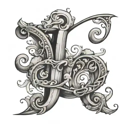
Three letters carry weight. Whether representing names, dates, or personal mantras, the R Y J combination demands clarity and bold presence. This design utilizes solid black linework to ensure legibility over time, avoiding fine lines that blur as skin ages. The spacing between characters is balanced to maintain individual identity while functioning as a cohesive unit. Ideal for those seeking meaningful ink without excessive ornamentation, this piece relies on typography rather than imagery to convey message. Placement flows naturally along muscle grain, ensuring the text remains straight during movement. Suitable for memorial pieces, relationship markers, or self-identity statements, the high-contrast black-grey palette guarantees visibility against all skin tones. Keep lines thick enough to prevent blowout, preserving the sharp edges essential for readable text. Consider sizing carefully; text tattoos require minimum height to remain distinct after healing. Small details may merge over decades, so prioritize boldness over delicacy. This design adapts well to curved surfaces, though flat planes offer the best canvas for straight typography. The aesthetic remains timeless, bypassing trend cycles associated with illustrative or colored work. Professionals recommend consulting with artists specializing in typography to ensure kerning and alignment meet professional standards before needle touches skin.
Noticeable discomfort, prepare for some sensitivity
Expect moderate discomfort on fleshy areas like the inner forearm. Bony zones such as wrists or ribs amplify vibration, increasing sensitivity. Text work requires steady hand positioning, prolonging session time. Deep breathing helps manage consistent shading discomfort. Topical numbing creams are effective for smaller lettering. Breaks every thirty minutes maintain comfort. Hydration prior to appointment reduces skin sensitivity.
Inner forearm offers the flattest surface for straight text, ensuring letters do not distort during arm rotation. Wrists provide high visibility but require smaller sizing, risking long-term legibility. Rib placements follow natural body curves, creating a dynamic flow but increasing discomfort. Collarbone areas highlight the text elegantly yet expose ink frequently. For professional environments, upper arm or thigh placements allow easy concealment. Minimum height should exceed half an inch to prevent ink spreading. Avoid joints where skin creases frequently, breaking up letter continuity.
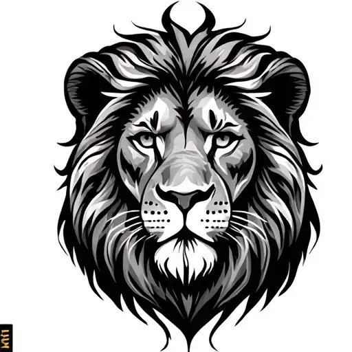
lettering is a distinctive tattoo style characterized by Lettering: Lettering tattoos focus on typography as the primary design element, featuring custom fonts, hand-lettered text, and creative text compositions. From elegant calligraphy to bold block letters, these designs turn words into visual art. Minimalist: Clean, simple tattoos featuring essential elements with minimal detail. These understated designs focus on clean lines, negative space, and refined simplicity, proving that sometimes less truly is more.. This style has gained popularity for its versatility and visual appeal.
Yes, this design is well-suited for square placement. This lettering design is ideal for square placement. Consider consulting with a professional tattoo artist about the best placement for this design.
The duration depends on the size, complexity, and detail level. A design of this style typically requires 2-4 hours for a medium-sized piece, but consult with your artist for an accurate estimate.
Tattoo pricing varies by artist, location, and design complexity. Prices typically range from $150-$500+ for a design of this style. Always consult with your chosen artist for an accurate quote.
Proper aftercare is crucial for square tattoos. Keep the area clean, moisturized, and protected from sun exposure. Follow your artist's specific aftercare instructions for best results.
tall
square