1/2 • Click to zoom
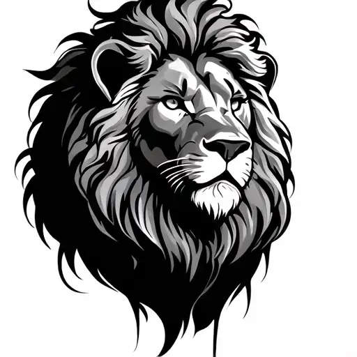
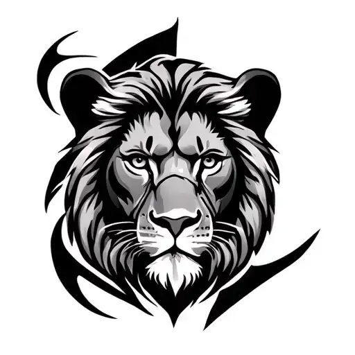
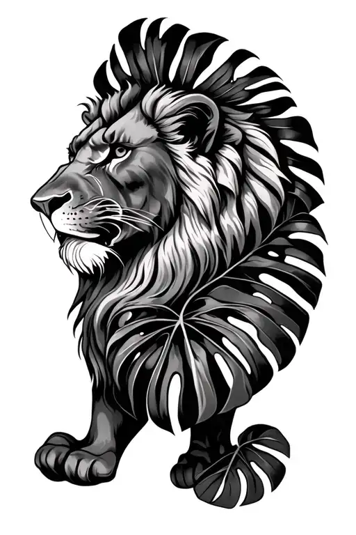
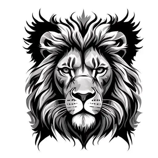
Merging wildlife intensity with linguistic artistry, this design constructs a fierce lion visage entirely from typographic elements. Each letter curves to define muscle structure and mane flow, creating a dual-layered meaning that celebrates strength and communication. Executed in bold black ink, the piece relies on high contrast to maintain legibility while forming a recognizable animal portrait. Ideal for clients seeking symbolism beyond standard imagery, this work demands sufficient surface area to prevent text blurring over time. Best suited for flat canvases like the forearm or chest where square compositions sit naturally without distortion from muscle movement. This typographic approach transforms standard lettering into a cohesive image, requiring an artist skilled in both calligraphy and animal anatomy. The density of ink ensures longevity, though touch-ups may be needed for fine textual details after healing. Whether representing a name, quote, or abstract script, the lion remains the dominant focal point, roaring silently through the weight of the words themselves.
Noticeable discomfort, prepare for some sensitivity
Expect moderate discomfort due to precision typographic linework. Outer forearm scores lower, allowing longer sessions without fatigue. Chest areas near the sternum involve significantly higher sensitivity. Solid packing causes heat buildup, so request frequent breaks. Hydrate beforehand and use controlled breathing during dense shading. Discuss topical numbing options for sensitive zones beforehand.
For optimal legibility, place this square composition on flat surface areas with minimal skin elasticity. The outer forearm offers high visibility and moderate pain, allowing the text details to remain crisp over time. Chest placement provides a broader canvas for larger scales, ensuring individual letters do not blur during the healing process. Avoid highly contoured zones like the ribs or elbows where distortion occurs frequently. Minimum width should be four inches to preserve textual clarity. Consider professional visibility, as prominent lettering draws immediate attention compared to standard imagery. Symmetrical placement on both arms works well for balanced aesthetics.
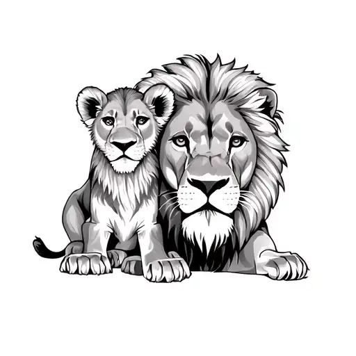
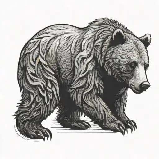
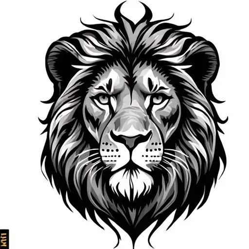
lettering is a distinctive tattoo style characterized by Blackwork: Blackwork tattoos use exclusively black ink to create bold, graphic designs ranging from intricate patterns to large solid areas. This versatile style encompasses geometric patterns, illustrative work, and heavy coverage pieces that make powerful visual statements. Animal: Animal tattoos depict wildlife, pets, and creatures from the natural world in styles ranging from photorealistic to stylized. These designs celebrate the beauty, power, and symbolism of animals, often carrying deep personal meaning for the wearer. Lettering: Lettering tattoos focus on typography as the primary design element, featuring custom fonts, hand-lettered text, and creative text compositions. From elegant calligraphy to bold block letters, these designs turn words into visual art.. This style has gained popularity for its versatility and visual appeal.
Yes, this design is well-suited for square placement. This lettering design is ideal for square placement. Consider consulting with a professional tattoo artist about the best placement for this design.
The duration depends on the size, complexity, and detail level. A design of this style typically requires 2-4 hours for a medium-sized piece, but consult with your artist for an accurate estimate.
Tattoo pricing varies by artist, location, and design complexity. Prices typically range from $150-$500+ for a design of this style. Always consult with your chosen artist for an accurate quote.
Proper aftercare is crucial for square tattoos. Keep the area clean, moisturized, and protected from sun exposure. Follow your artist's specific aftercare instructions for best results.
square