1/2 • Click to zoom
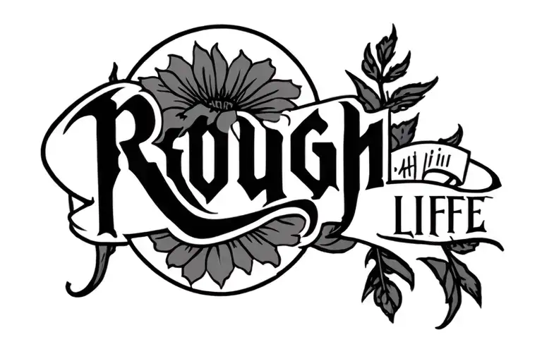
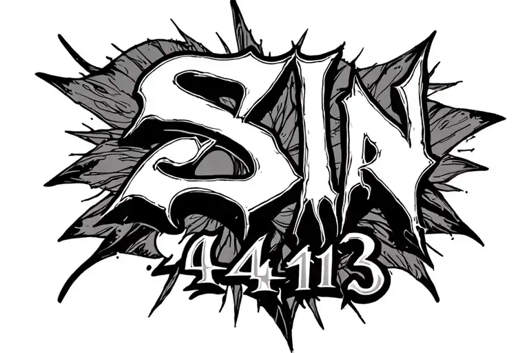
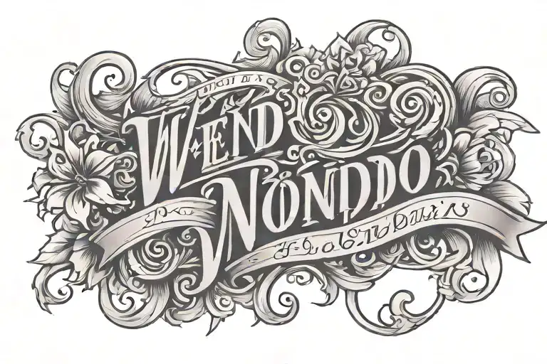
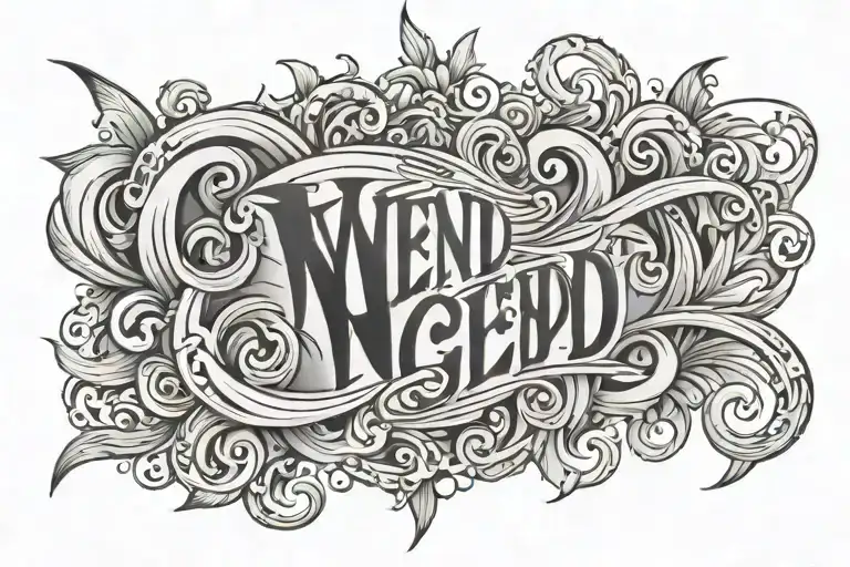
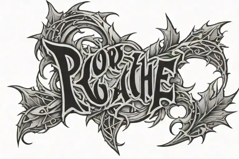
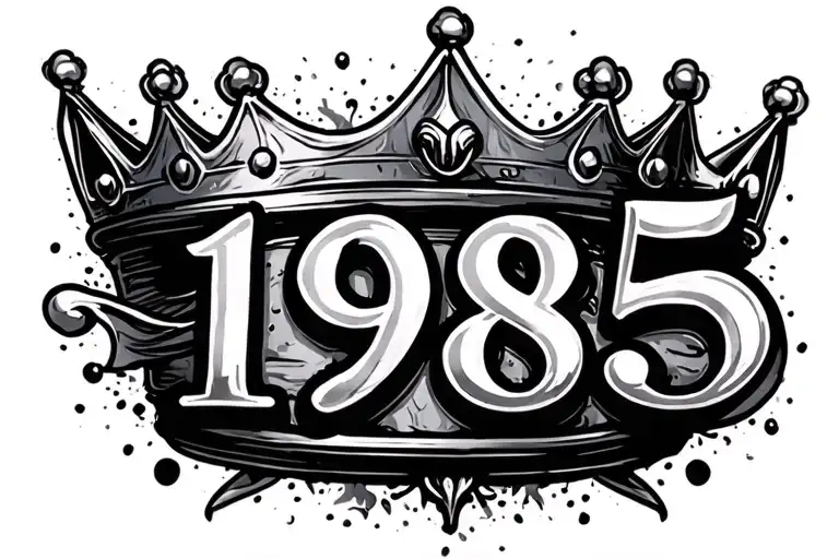
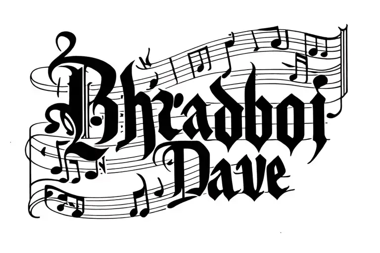
Preserving significant moments requires typography that stands the test of time. This design features clean, bold lettering showcasing the name Wend-nongdo alongside the specific date 14.9.2014. The layout prioritizes horizontal flow, making it ideal for wide body canvases where text remains legible without distortion. Black and grey ink ensures high contrast and aging stability, crucial for fine text details. Whether marking a birth, anniversary, or memorial, this piece serves as a permanent reminder of a pivotal life event. Artists should focus on consistent kerning and stroke weight to maintain readability over decades. Ideal for those seeking meaningful minimalism without excessive ornamentation. The simplicity allows the message to take center stage, avoiding distracting elements that might clutter the personal significance. Proper sizing ensures the date remains clear even as skin changes over years. Incorporating this design into your collection offers a timeless approach to personal storytelling. The balanced spacing prevents ink blowout, a common issue with small text tattoos. Placement on flatter surfaces maintains the integrity of the straight lines. This style complements existing ink or stands alone as a focal point. Clients often choose this for its understated elegance and profound emotional weight. Professional execution guarantees crisp edges that define high-quality lettering work.
Manageable pain, suitable for most people
Expect moderate discomfort on the forearm due to muscle cushioning, while collarbone sessions involve higher sensitivity near bone. Fine lettering requires slow, precise needlework which can increase heat sensation. Breathing techniques help manage rib discomfort during expansion. Topical numbing creams are generally discouraged as they may affect ink retention. Schedule breaks for sessions exceeding two hours to maintain stillness.
Horizontal text flows best along natural body lines that mimic a banner. The outer forearm offers a flat surface with moderate visibility, perfect for frequent viewing. Collarbone placement follows the bone structure for a striking aesthetic, though skin thinness requires careful needle depth. Ribs provide ample width but curve significantly, potentially distorting straight text during breathing. For professional settings, forearm placement allows easy concealment with long sleeves. Minimum width should exceed six inches to prevent letter crowding. Avoid high-friction areas like hands or feet where text fades rapidly.
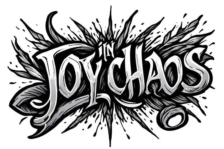
lettering is a distinctive tattoo style characterized by Blackwork: Blackwork tattoos use exclusively black ink to create bold, graphic designs ranging from intricate patterns to large solid areas. This versatile style encompasses geometric patterns, illustrative work, and heavy coverage pieces that make powerful visual statements. Lettering: Lettering tattoos focus on typography as the primary design element, featuring custom fonts, hand-lettered text, and creative text compositions. From elegant calligraphy to bold block letters, these designs turn words into visual art.. This style has gained popularity for its versatility and visual appeal.
Yes, this design is well-suited for wide placement. This lettering design is ideal for wide placement. Consider consulting with a professional tattoo artist about the best placement for this design.
The duration depends on the size, complexity, and detail level. A design of this style typically requires 2-4 hours for a medium-sized piece, but consult with your artist for an accurate estimate.
Tattoo pricing varies by artist, location, and design complexity. Prices typically range from $150-$500+ for a design of this style. Always consult with your chosen artist for an accurate quote.
Proper aftercare is crucial for wide tattoos. Keep the area clean, moisturized, and protected from sun exposure. Follow your artist's specific aftercare instructions for best results.
wide

wide
wide
wide
wide