1/2 • Click to zoom
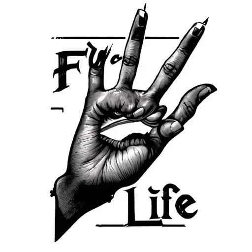
Representing hometown pride with ink, this design captures the essence of Southeast San Diego through bold lettering. Known locally as "Daygo," this area holds cultural significance for many residents, making it a popular choice for commemorative body art. The black-grey palette ensures timeless readability, avoiding the fading issues associated with color packing. Script styles flow naturally along muscle contours, allowing the text to breathe while maintaining structural integrity. Whether opting for fine line precision or bold traditional lettering, this piece serves as a permanent reminder of roots. Ideal for those seeking a personal connection to their community, the design balances legibility with artistic flair. Placement matters significantly for text; flat surfaces ensure the words remain untorted over time. This aesthetic fits seamlessly into collections focusing on location-based symbolism or typographic artistry. Incorporating subtle shading techniques enhances depth without compromising the crisp edges required for legible text. Artists often recommend sizing the piece large enough to prevent ink blowout as the skin ages. The simplicity of the black-grey scheme allows for versatility in styling, pairing well with other geometric or illustrative elements. Clients should discuss font weights with their artist to ensure the message remains clear from a distance. This design transcends trends, grounding the wearer in their personal geography. It is a statement of identity, worn proudly on the skin.
Manageable pain, suitable for most people
Expect moderate sensation on the outer forearm, comparable to a cat scratch. Rib placements intensify discomfort due to thin skin over bone. Text work demands steady hand precision, potentially prolonging session time. Numbing cream is unnecessary for forearm placements but recommended for ribs. Stay hydrated to maintain pain tolerance.
For text-based designs like this, flat surface areas are critical to prevent distortion. The outer forearm offers excellent visibility and low pain, making it ideal for first-timers wanting to display their hometown pride. The ribs provide a larger canvas for longer phrases but involve higher discomfort due to bone proximity. Ensure the text runs parallel to muscle fibers to minimize stretching effects over time. Minimum width should be two inches to maintain legibility as ink settles. Avoid high-friction zones like hands or feet where text fades rapidly.
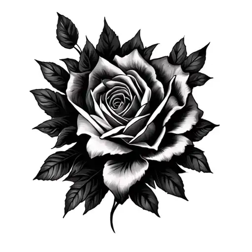
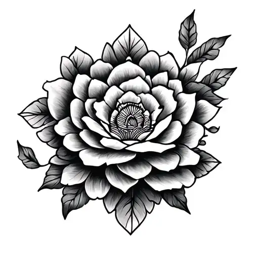
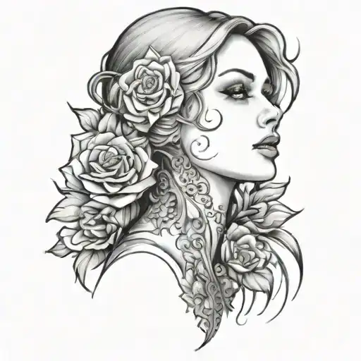
lettering is a distinctive tattoo style characterized by Script: Elegant tattoos featuring stylized lettering, quotes, names, or meaningful phrases. Script tattoos can range from classic calligraphy to modern typography, often carrying deep personal significance. Lettering: Lettering tattoos focus on typography as the primary design element, featuring custom fonts, hand-lettered text, and creative text compositions. From elegant calligraphy to bold block letters, these designs turn words into visual art.. This style has gained popularity for its versatility and visual appeal.
Yes, this design is well-suited for square placement. This lettering design is ideal for square placement. Consider consulting with a professional tattoo artist about the best placement for this design.
The duration depends on the size, complexity, and detail level. A design of this style typically requires 2-4 hours for a medium-sized piece, but consult with your artist for an accurate estimate.
Tattoo pricing varies by artist, location, and design complexity. Prices typically range from $150-$500+ for a design of this style. Always consult with your chosen artist for an accurate quote.
Proper aftercare is crucial for square tattoos. Keep the area clean, moisturized, and protected from sun exposure. Follow your artist's specific aftercare instructions for best results.