1/2 • Click to zoom
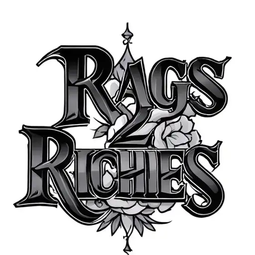
Embodying the ultimate hustle mentality, this design transforms a classic phrase into permanent ink. The bold typography commands attention, utilizing heavy black-grey shading to create depth and dimension within each character. Ideally suited for those who wear their journey on their skin, the text flows naturally across flat muscle groups. Placement on the forearm ensures high visibility, serving as a daily reminder of growth and perseverance. The stark contrast between ink and skin highlights the sharp edges of the lettering, making it legible from a distance. This piece works exceptionally well for individuals seeking a statement design without intricate imagery. Whether executed in graffiti-inspired bubbles or sharp serif fonts, the message remains clear. Professional artists recommend sizing this piece generously to prevent blurring over time. The simplicity of the concept allows for customization with surrounding elements like crowns or currency symbols. Ultimately, this tattoo represents resilience, financial success, and the grind required to achieve status. Consider how the text curves with your anatomy to maintain readability. Proper spacing between letters ensures longevity and crisp lines as the skin ages. This design resonates deeply within street culture and entrepreneurial communities alike.
Noticeable discomfort, prepare for some sensitivity
Expect moderate discomfort primarily from the saturation required for bold lettering. The outer forearm contains fewer nerve endings than inner areas, making it manageable for most clients. Solid black packing can generate heat, so request breaks if needed. Focus on steady breathing to manage tension during dense shading sections. Hydrate well before your session to keep skin resilient against the needle's repetitive motion.
Text-based designs require flat surfaces to maintain readability and structural integrity. The outer forearm offers ample space for horizontal layout, minimizing distortion during muscle flexion. Upper chest placement provides a broad canvas, allowing for larger lettering that ages gracefully. Avoid highly curved areas where text may warp over time. For optimal visibility, position the design parallel to the body's natural lines. Minimum width should exceed four inches to prevent ink spread from compromising legibility. Consider professional obligations before choosing highly visible locations. This design scales well, but shrinking below recommended dimensions risks losing detail in the serifs and shading.
lettering is a distinctive tattoo style characterized by Graffiti: Bold, urban-inspired tattoos featuring elements of street art, wild style lettering, and spray paint aesthetics. These dynamic designs capture the energy and rebellious spirit of graffiti culture. Lettering: Lettering tattoos focus on typography as the primary design element, featuring custom fonts, hand-lettered text, and creative text compositions. From elegant calligraphy to bold block letters, these designs turn words into visual art.. This style has gained popularity for its versatility and visual appeal.
Yes, this design is well-suited for square placement. This lettering design is ideal for square placement. Consider consulting with a professional tattoo artist about the best placement for this design.
The duration depends on the size, complexity, and detail level. A design of this style typically requires 2-4 hours for a medium-sized piece, but consult with your artist for an accurate estimate.
Tattoo pricing varies by artist, location, and design complexity. Prices typically range from $150-$500+ for a design of this style. Always consult with your chosen artist for an accurate quote.
Proper aftercare is crucial for square tattoos. Keep the area clean, moisturized, and protected from sun exposure. Follow your artist's specific aftercare instructions for best results.
square