1/2 • Click to zoom
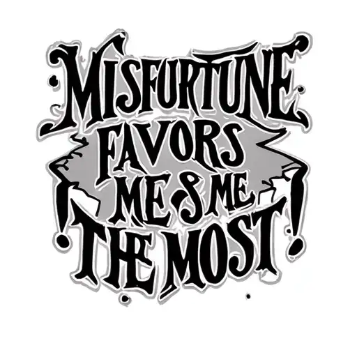
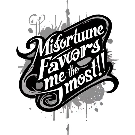
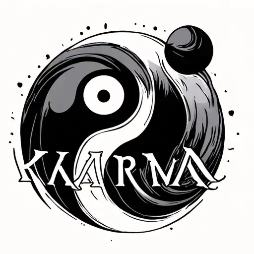
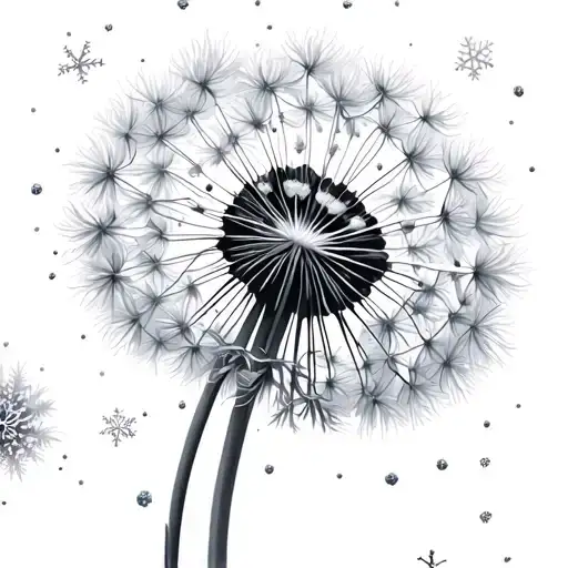
Embrace the paradox of luck with this bold text design featuring the phrase "Misfortune favors me the most!" Rendered in high-contrast black and grey ink, this piece prioritizes legibility and impact. The typography stands out against the skin, making a statement about resilience and accepting life's challenges. Ideal for those who wear their philosophy openly, the design works well on flat surfaces where text remains straight and readable over time. Whether chosen for personal motivation or aesthetic appeal, this lettering tattoo captures a darkly optimistic worldview. Professional application ensures clean edges and consistent saturation, preventing blowout in intricate letter shapes. Consider visibility when choosing placement, as text demands attention. This style bridges the gap between traditional script and modern blackwork, offering a timeless look that ages gracefully. The weight of the lines ensures longevity, minimizing the need for frequent touch-ups compared to fine line alternatives. It serves as a permanent reminder that even in adversity, there is a unique advantage to be found. Artists recommend discussing font weight and sizing to ensure the text remains crisp as the skin matures over decades.
Noticeable discomfort, prepare for some sensitivity
Expect moderate discomfort depending on chosen placement. Outer forearm areas feature thicker skin and fewer nerve endings, resulting in manageable sensation. Rib and collarbone zones involve thinner skin over bone, increasing sensitivity significantly. Lettering requires steady handwork, which may prolong session time in sensitive zones. Practice deep breathing techniques to manage discomfort during intricate line work. Topical numbing creams are effective for bony areas if approved by your artist.
For optimal readability, place this text design on flatter body surfaces where skin distortion is minimal. The outer forearm offers excellent visibility and moderate pain, allowing the letters to remain straight during movement. Rib placements create a dramatic flow along the body's curve but require careful sizing to prevent warping. Collarbone placements highlight the text elegantly but involve thinner skin. Ensure the length of the phrase fits the anatomy without wrapping awkwardly around joints. Minimum width should be 3 inches to maintain letter integrity.
lettering is a distinctive tattoo style characterized by Blackwork: Blackwork tattoos use exclusively black ink to create bold, graphic designs ranging from intricate patterns to large solid areas. This versatile style encompasses geometric patterns, illustrative work, and heavy coverage pieces that make powerful visual statements. Lettering: Lettering tattoos focus on typography as the primary design element, featuring custom fonts, hand-lettered text, and creative text compositions. From elegant calligraphy to bold block letters, these designs turn words into visual art.. This style has gained popularity for its versatility and visual appeal.
Yes, this design is well-suited for square placement. This lettering design is ideal for square placement. Consider consulting with a professional tattoo artist about the best placement for this design.
The duration depends on the size, complexity, and detail level. A design of this style typically requires 2-4 hours for a medium-sized piece, but consult with your artist for an accurate estimate.
Tattoo pricing varies by artist, location, and design complexity. Prices typically range from $150-$500+ for a design of this style. Always consult with your chosen artist for an accurate quote.
Proper aftercare is crucial for square tattoos. Keep the area clean, moisturized, and protected from sun exposure. Follow your artist's specific aftercare instructions for best results.
square
square
square
square