1/8 • Click to zoom
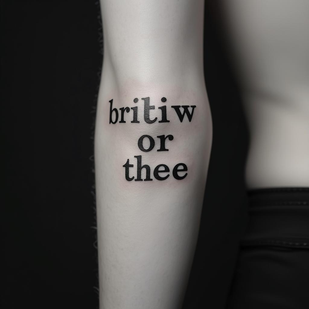
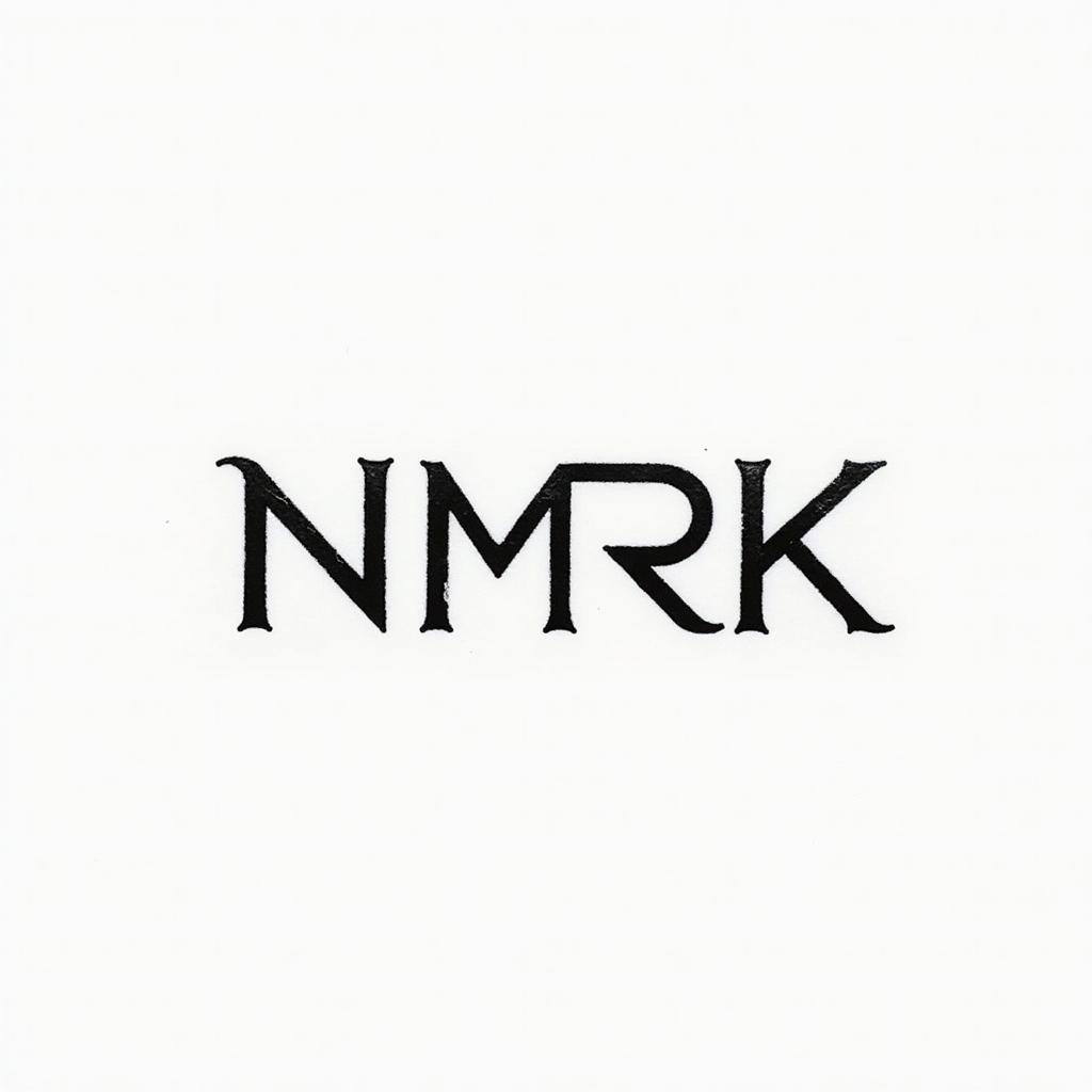
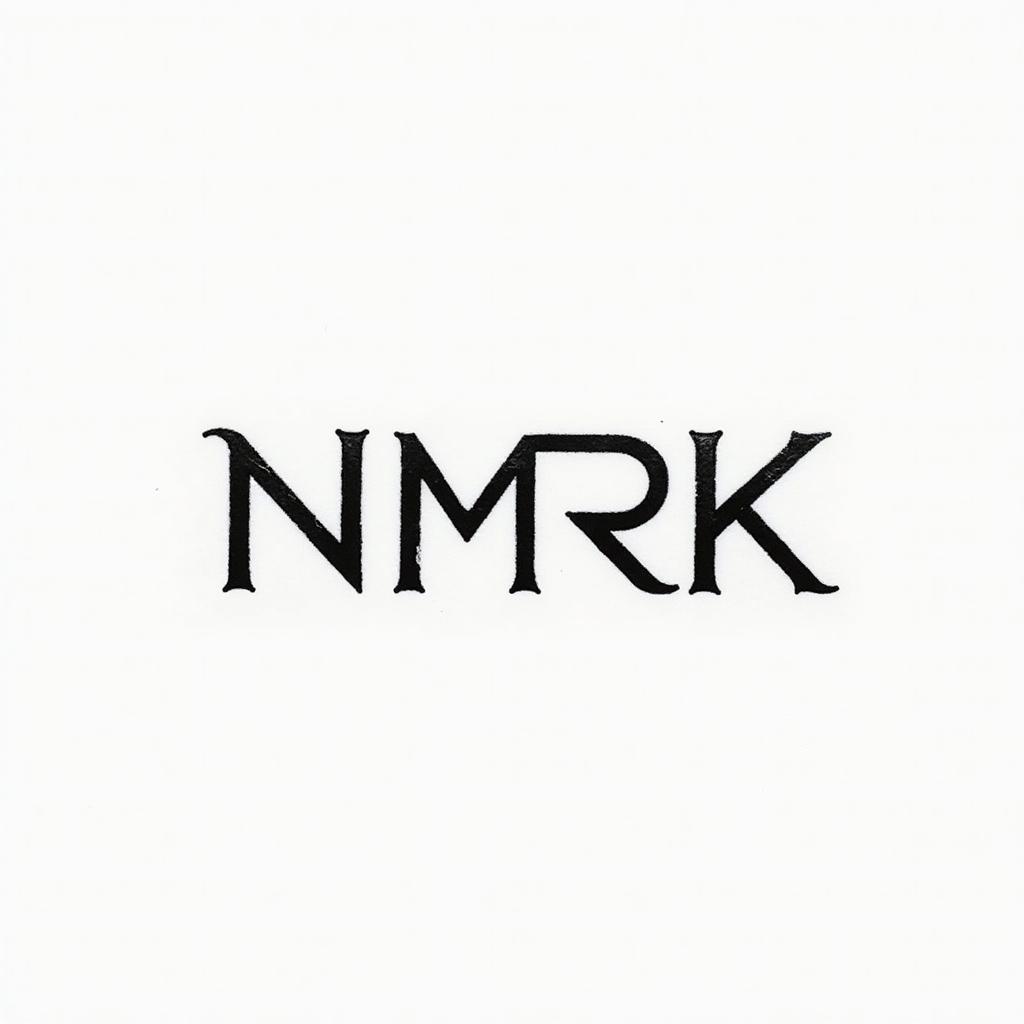
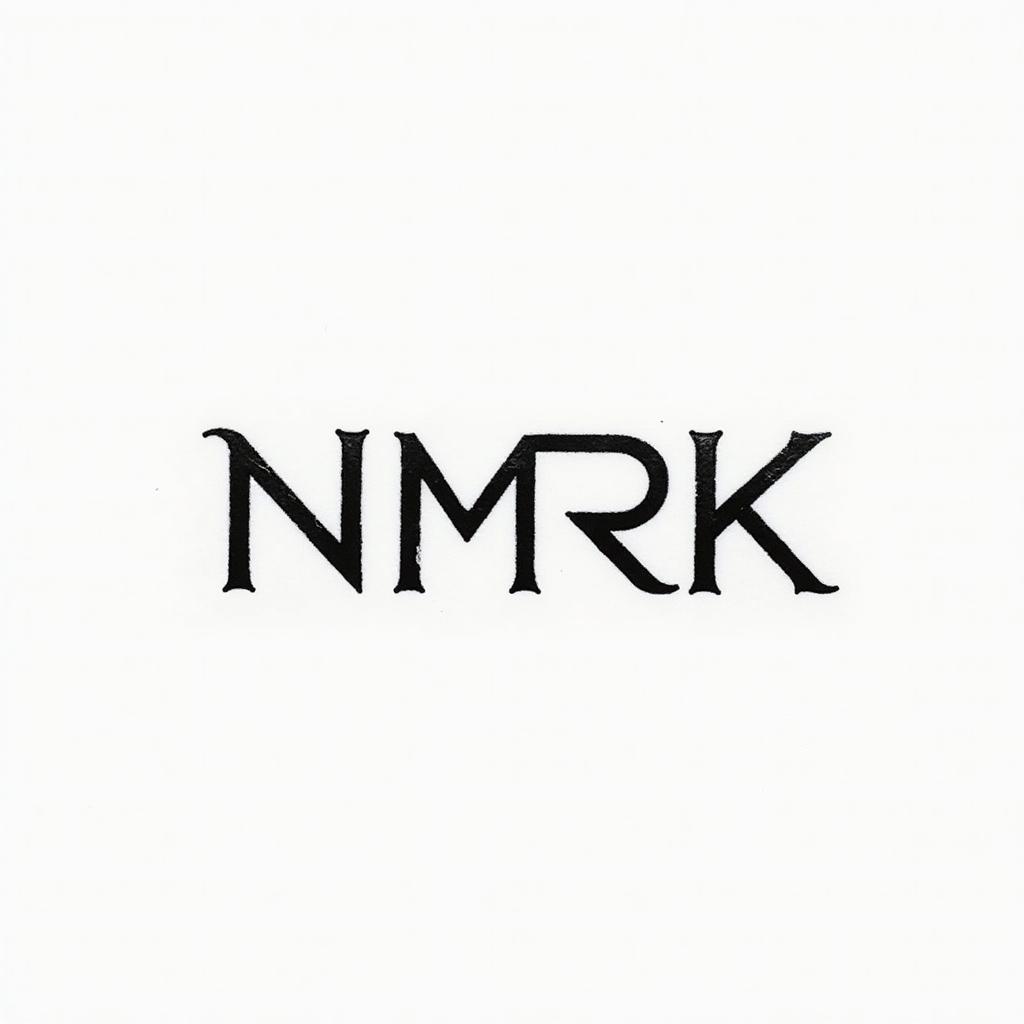
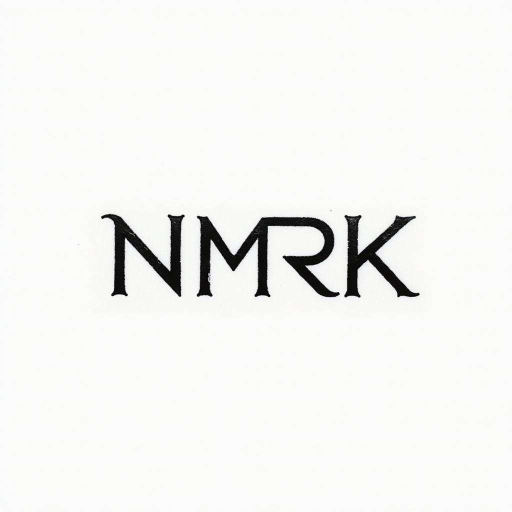
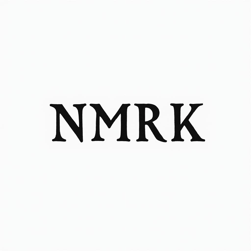
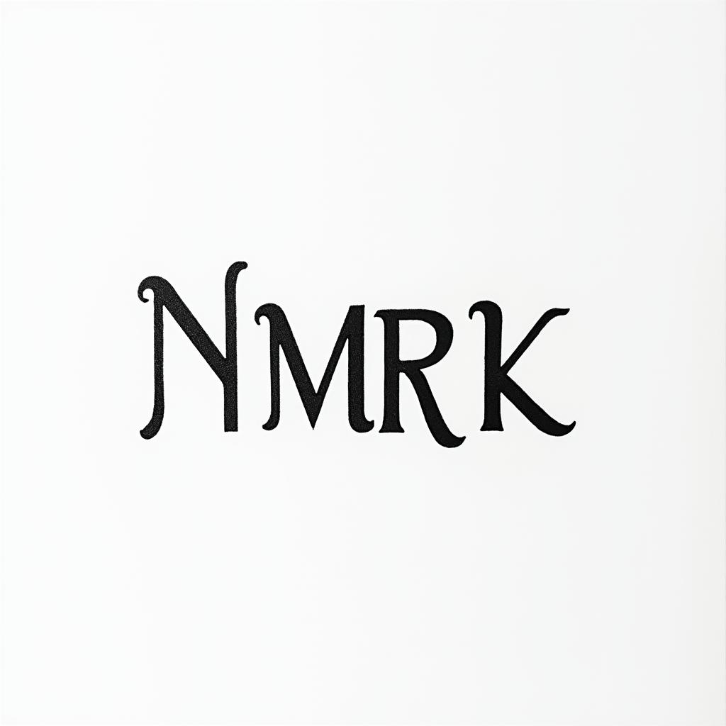
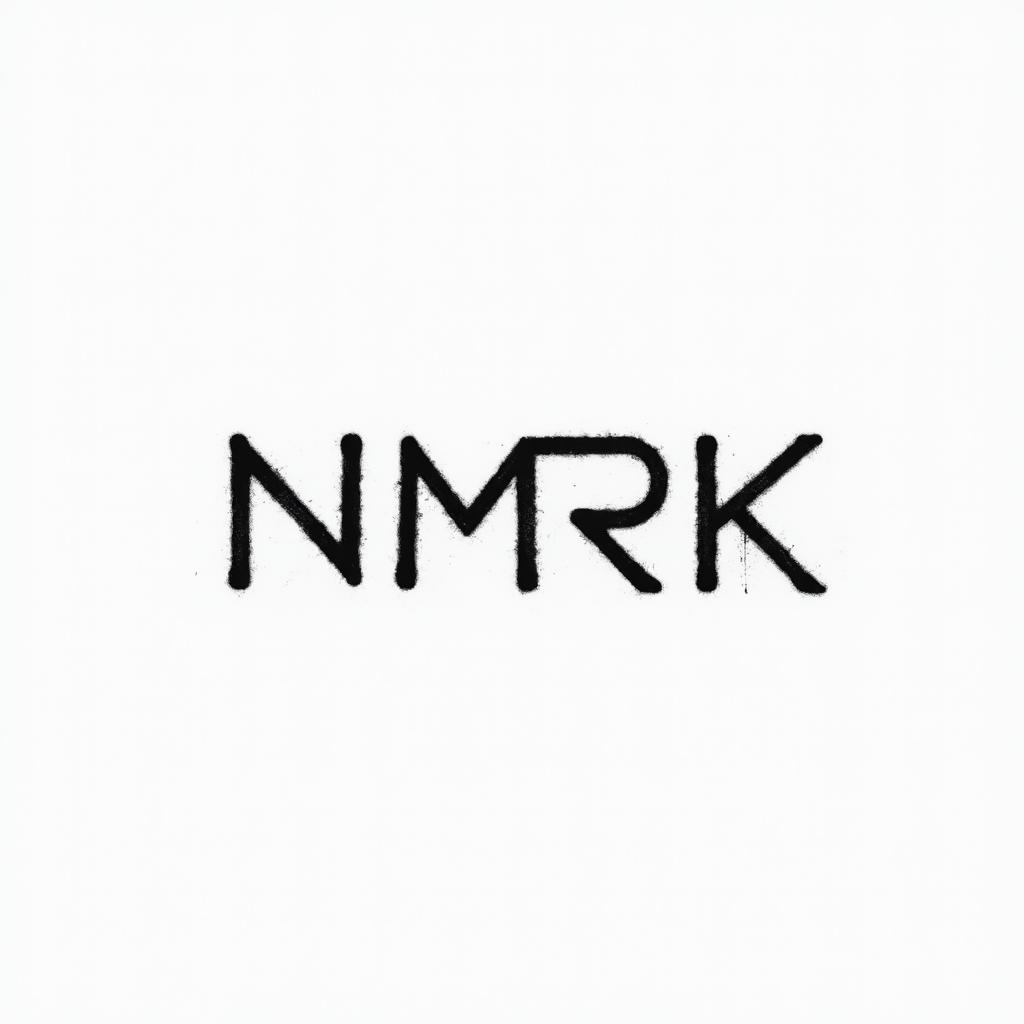
Typography meets skin art in this crisp monospace design. The "NMRK" lettering utilizes a fixed-width font structure, creating a digital-age aesthetic rooted in mechanical precision. Unlike script or traditional lettering, monospace offers uniform spacing that reads clearly even at smaller sizes. This minimalist approach strips away ornamentation, focusing entirely on form and negative space. Ideal for those seeking modern subtlety, the design relies on solid black ink density rather than shading gradients. Placement flows best along linear body contours where the text can remain horizontal without distortion from muscle movement. A timeless choice for coders, writers, or anyone valuing clean communication through ink. Ensure proper sizing to prevent blowout over time, as tight letter spacing requires breathing room between characters. Professional application guarantees sharp edges without bleeding. The bold black strokes create high contrast against natural skin tones, ensuring legibility from a distance. Because monospace fonts mimic typewriter mechanics, each character occupies equal horizontal space, lending a structured, rhythmic quality to the piece. This uniformity prevents visual clutter, making it an excellent option for meaningful acronyms or initials. Long-term retention depends on adequate sizing; shrinking text too much risks ink migration blurring distinct lines. Consult with your artist about needle grouping to achieve crisp terminals and corners. This design bridges the gap between digital identity and physical permanence, suitable for visible or private placement depending on personal preference.
Noticeable discomfort, prepare for some sensitivity
Text tattoos require steady needle work, often feeling like a consistent scratching sensation. Inner forearm areas possess moderate nerve density, manageable for most clients. Rib and collarbone zones involve thinner skin over bone, increasing sensitivity. Maintain steady breathing during long lines to prevent muscle tension. Topical anesthetics work well on flat surfaces. Breaks between letters allow skin recovery.
Linear text designs demand flat surface areas to maintain readability. The inner forearm offers ample space for horizontal alignment with minimal distortion during movement. Collarbone placement follows the natural bone structure for a striking visual, though skin thinness varies. Ribcage options provide a larger canvas but curve significantly, requiring stencil adjustment to ensure letters remain level. For professional settings, forearm options allow easy concealment with long sleeves. Minimum width should exceed 6 inches to prevent ink spreading from compromising character distinction over time.
monospace-text is a distinctive tattoo style characterized by Monospace Text: Clean, technical tattoos featuring text in computer-style monospace fonts where each character occupies the same width. Popular for coding references, technical quotes, or minimalist text designs. Lettering: Lettering tattoos focus on typography as the primary design element, featuring custom fonts, hand-lettered text, and creative text compositions. From elegant calligraphy to bold block letters, these designs turn words into visual art. Minimalist: Clean, simple tattoos featuring essential elements with minimal detail. These understated designs focus on clean lines, negative space, and refined simplicity, proving that sometimes less truly is more.. This style has gained popularity for its versatility and visual appeal.
The duration depends on the size, complexity, and detail level. A design of this style typically requires 2-4 hours for a medium-sized piece, but consult with your artist for an accurate estimate.
Tattoo pricing varies by artist, location, and design complexity. Prices typically range from $150-$500+ for a design of this style. Always consult with your chosen artist for an accurate quote.